18.01.2024
Twenty Years Apart | A Tale of Two Exhibitions
Last month I visited the Philip Guston exhibition at Tate Modern.
My admiration for Guston's work and story began twenty years ago with the 2003 retrospective at the Royal Academy in London.
Although I have seen examples of Guston's work in galleries and museums since then the Tate show was the first time since 2003 that I had seen such a major review of his entire work.
It was especially interesting for me to "re-visit" Guston's work last month given the development of my artistic position since 2003.
Back in 2003 I had just taken up painting again seriously after a gap of many years. My painting was figurative which I saw as being out of step with the abstract painting of the mainstream art world.
I was impressed and inspired by Guston's work but at that time particularly by the fact that in later life he had switched from abstract painting to figurative painting.
I loved that Guston had risked a highly prestigious and lucrative career as an abstract artist in search of authenticity. I loved too that his late work had upset the art world orthodoxy and I loved that he had "chosen" figurative art.
Guston's life-long love of comics spoke to me in 2003 too.
On the foundation course in 1988/1989 I had enjoyed the introductory module on illustration. As a kid I'd loved comics and admired comic artists for their drawing technique. I saw my own drawing technique as not polished enough for such a career. All the same back in 1988 I was firmly set on being a painter and "fine artist" and not a "mere" illustrator.
These days the art world no longers makes that kind of distinction.
In the last twenty years I have learned not to see things in such "either-or" terms, figurative "or" abstract.
Only a few years ago my own work moved from figuration to abstraction, something that back in 2003 I would not have expected to happen even though a lot of my painting as an art student had been abstract.
Guston's late work was a revelation in 2003 because it spoke to me of an intoxicating artistic freedom and a monumental fearlessness. His bravery as an artist gave me hope.
Today, twenty years on, Guston remains a hero of mine but in a subtler way to 2003.
He is a hero because he was in large part self-taught even though he attended some art schools.
He is a hero too not because his late work validated figuration more than abstraction but because it proved that in the final analysis this was a false dichotomy. There is only ever painting.
29.12.2023
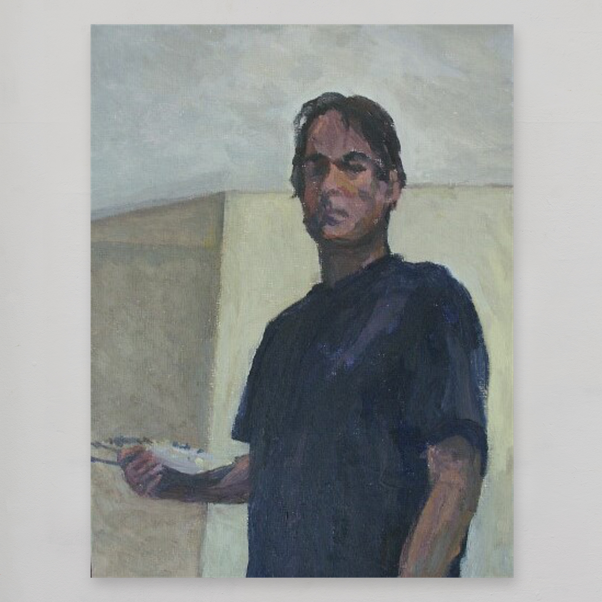
Twenty years ago
Twenty years ago I decided that finding my way as an artist was something from which I would no longer flee.
Driven by a desperate need for authenticity in my life and haunted by the fear I might have left it all too late I determined to set aside self-doubt once and for all and be true to myself.
A long and winding road
My artist's path up until 2003 had been a long and winding road. A last minute fear of failure back in 1982 had made me abandon plans to go to art school. With no Plan B I didn't know what else to do and so I took a job in banking. Five years later I abandoned a highly lucrative investment banking career to prepare an application to Kingston Polytechnic's foundation course.
But in 1989 just as that one-year course finished and a degree course beckoned a series of life-changing decisions and actions on my part found me with new priorities seemingly more pressing than the dream of being an artist.
New pressures followed and a creative block revived old insecurities; the artist's way suddenly seemed lost to me. Broke and with the rural family home still a derelict building site in 1990 I accepted the loss of my dream as fact and took a job back in London; this time a job without the high-flying career and salary of three years before.
Fast forward thirteen years later to 2003. By now I had not only let others down but had been untrue to myself for far too long. For better or worse, my art was something I no longer wished to run away from.
man with palette, standing 2003, oil on board 30 x 22.5 cm
13.12.2023
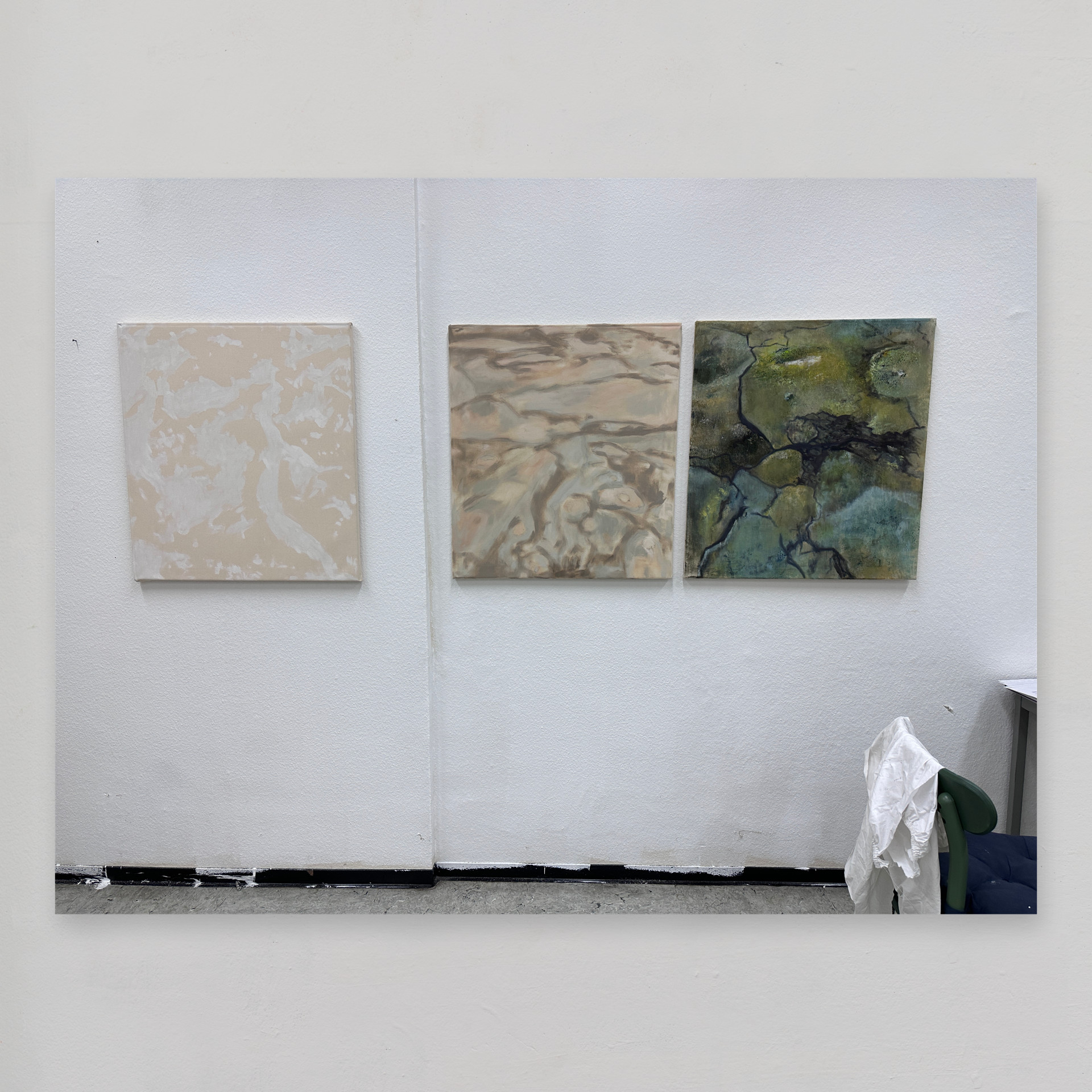
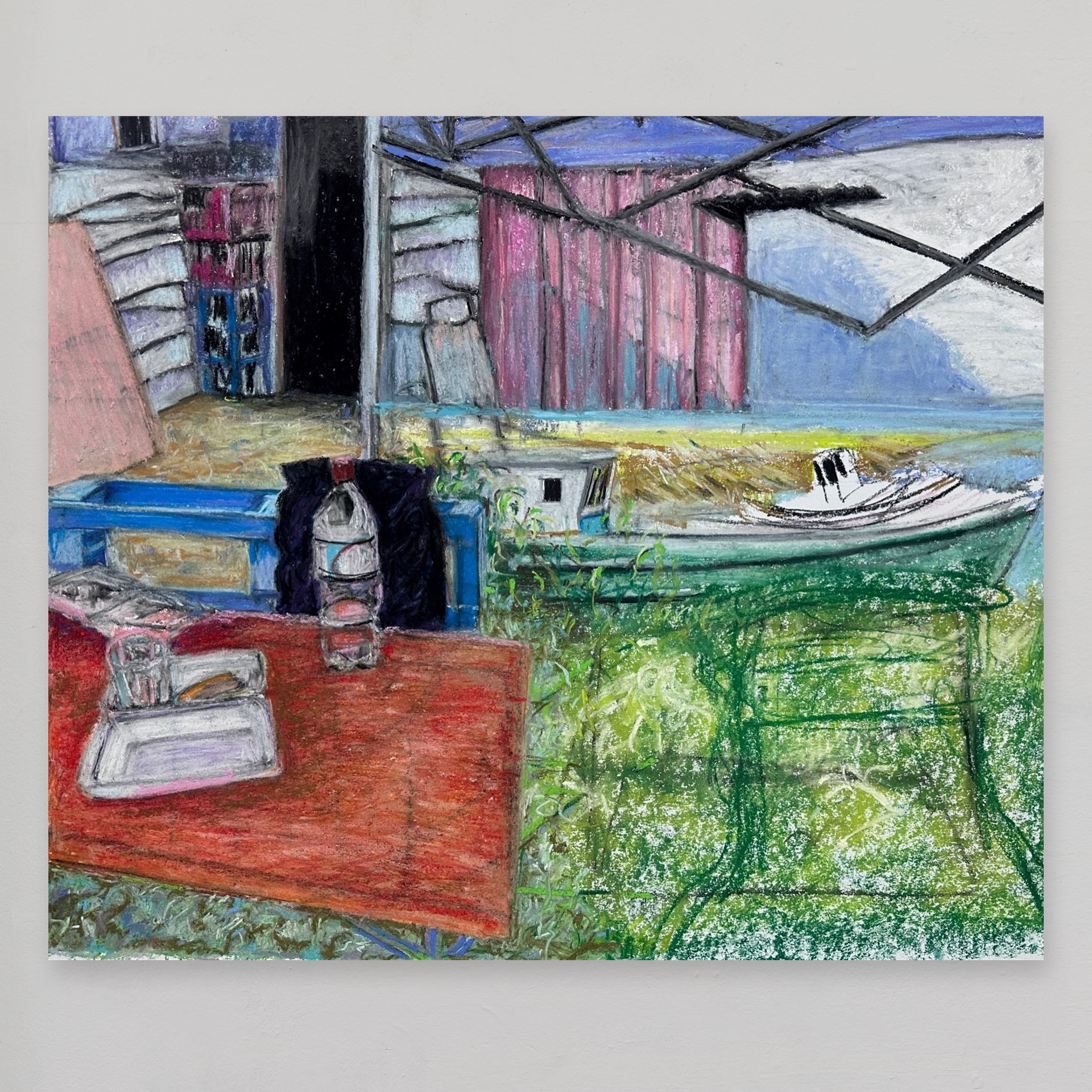
abstracting memories: an update
Let me say, first of all, that I'm enjoying painting.
There was a low moment back in October when I considered discarding the three paintings I had begun in early September. That moment passed, however, with the help of a conversation with a friend and colleague.
So what am I doing?
Or rather, what do I think I'm doing? For it is a cliché of the creative process that a painting will always assume a life and direction of its own, whatever cunning plans the artist may have laid out in advance.
What I think I'm doing is combining extracts of photographs to construct an abstract image in which shapes and forms sit in a space of their own.
Is there something different about this subject matter compared with recent work?
Yes. Each painting is in effect a collage of memories.
One of them (the canvas in the middle) sources memories from several different trips whereas the other two deal with one particular trip in March 2023. This was a 1 242 km road and ferry trip through Patagonian Chile.
These latter paintings aim to reflect how the natural and the man-made worlds inter-act to produce a unique landscape that fascinated me and inspires me.
The interaction between the man-made and the natural is, after all, what it comes down too, isn't it? How we interact with the natural world.
So how does this feed into my art?
My photographs record the beauty I saw in the shapes and forms of the man-made landscape and in the way the artificial sat within the natural landscape.
My artistic practice begins by taking figurative elements from a photograph, stripping these down to their basic abstract forms and then combining these shapes and forms with others, similarly abstracted from other photographic extracts.
My aim is for these things to escape their original identity within the photographic image and acquire a new identity within the painting's context as they interact with other shapes and forms I abstracted from other photographs.
How each "abstracted element" interacts with the one next to it in the painting is also key.
As the viewer's eye transitions from one shape to the next across the picture plane I aim to suggest a sense of space and depth that is ambiguous yet internally consistent.
Well, that's what I think I'm doing. Like I said above, the paintings are acquiring a life of their own.
It seems that my visceral love of recording and observing things that I find beautiful - be they man-made or natural - as I found them in natura seems to hold me back from turning the figurative images into non-recognisable abstract versions thereof.
It's as though these memories demand that I record them in all their glorious detail when what I am trying to do is (cruelly, perhaps) boil them down to anonymous abstract forms and shapes.
As I said above: I'm having fun.
Oil paint (a Freudian typo made me write oil pain) takes longer to dry at this time of year so that is slowing things down too.
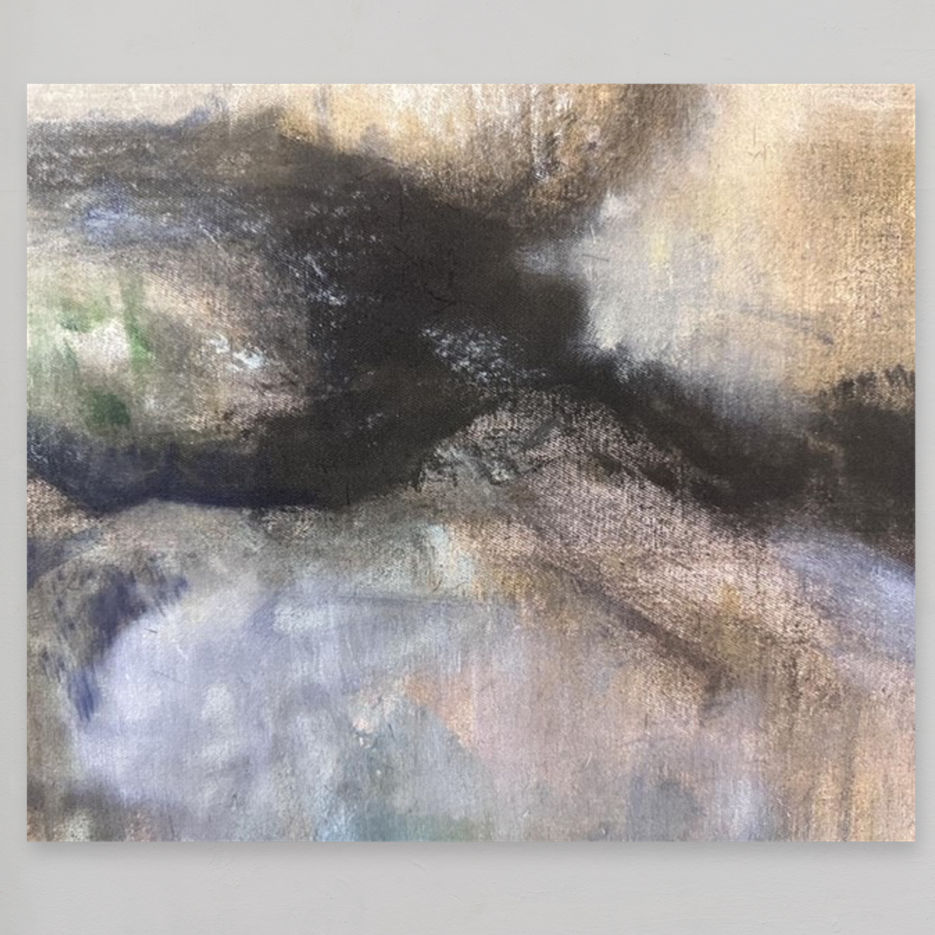
I have no idea now how these paintings will turn out but I find their evolution exciting. With two of the canvasses it's been hard work sorting out their compositions. For I wrongly believed in September that my preparatory pastel drawings (see works on paper on this website) had done all the "heavy lifting".
Wrong. Utterly wrong.
So. Watch this space and in the meantime Merry Christmas and a Happy New Year!
16.11.2023
oil painting on raw, unprepared canvas
On my return to the studio this Summer after extensive travelling in the first half of the year I tried out something new: painting in oil colour on a piece of raw, unmediated canvas.
Why so?
Well, I'm always keen to explore new ways of manipulating oil colour in ways I can then deploy usefully in my work. This keenness dates back to 2007 when I first started learning about glazing techniques from internet pages.
So what happens when oil colour is applied straight from the tube - unmediated by any medium - on to a piece of raw, unprimed canvas stretched across a wooden frame?
Simple - at first. The raw fabric absorbs some of the oil and pigment of the tube colour as the barrier of acrylic sealant and gesso is not there to protect the fabric.
Some wonderful one-off effects can be achieved in this way. These effects cannot be corrected or repeated. The opportunity for this type of effect occurs when oil colour contacts the raw canvas.
Once the paint is properly dry it is possible to add a second layer of paint on to the first. Paint on paint will behave in ways similar to how paint behaves on a prepared canvas.
The canvas is not only raw but recycled: I use the reverse side of discarded paintings and stretch these anew. The recycled element of this project is not only exciting but liberating: somehow the fact that the fabric has already been used once before makes the blank canvas intimidate far less.
The physicality of the painting technique is also fun and liberating: the oil colour is pushed or forced into the weave of the raw canvas.
The first photo here is a studio view with three canvases: two shown after the first painting session and one work already completed. The dimensions are in each case 80 x 72 cm.
The second photo here is a detail from an early stage in the now complete work.
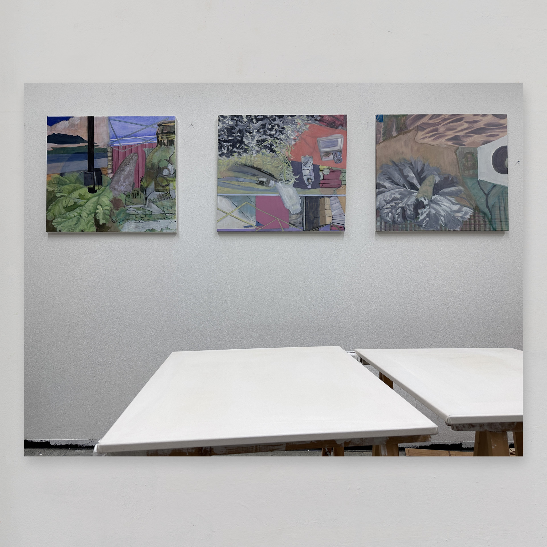
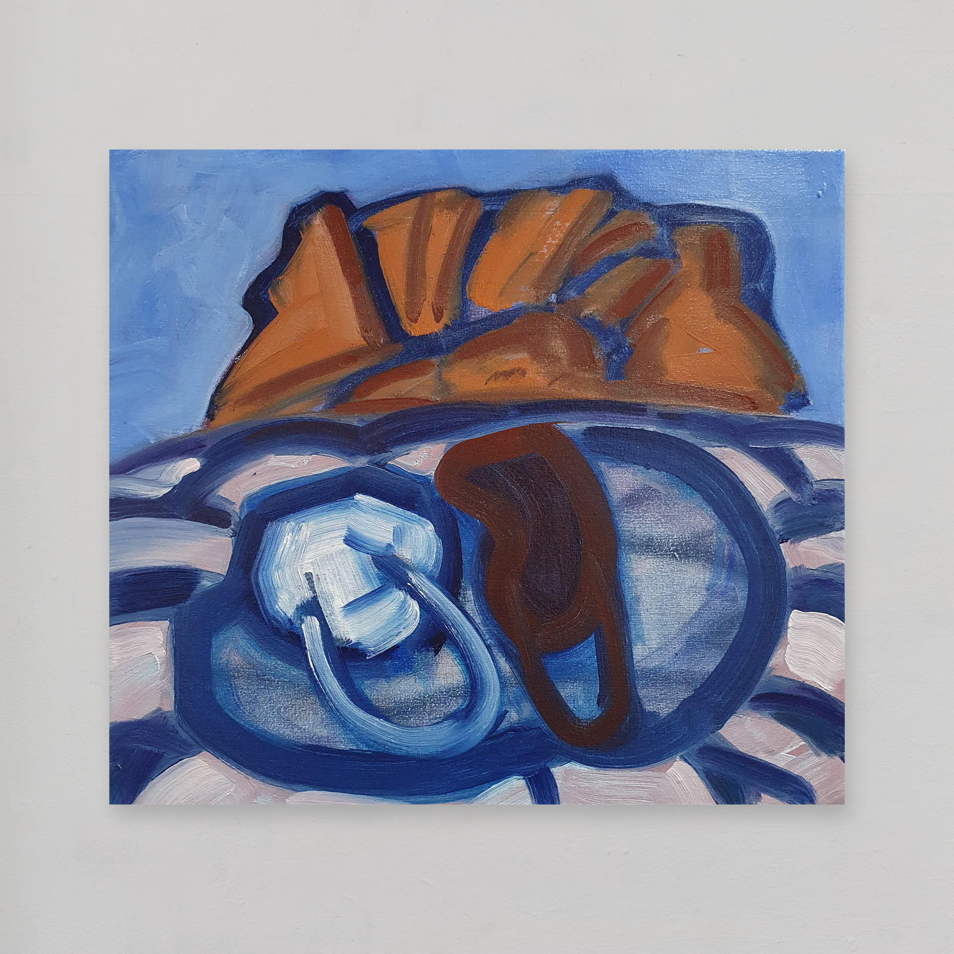
15.11.2023
translating ideas from one medium to another
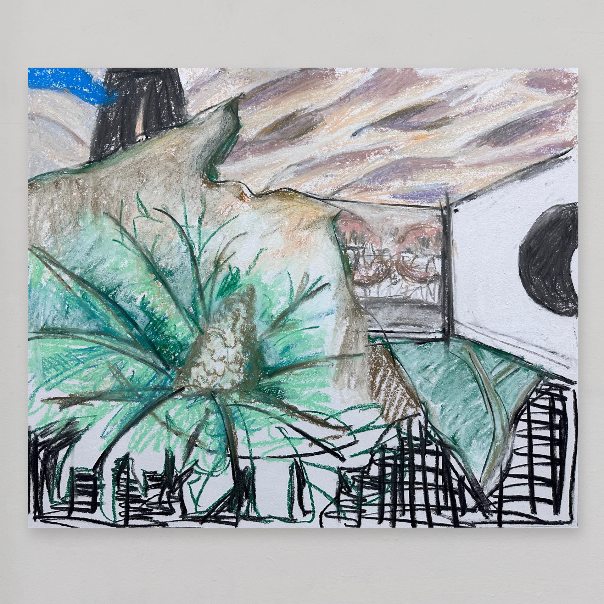
since September I have been working on three paintings in oil on canvas (shown here in the photo)
each of the three paintings remains a work in progress and the composition of each oil painting began as an idea first sketched out in pastel on paper (see previous blog entry).
each of the three pastel sketches was in fact a collage of memories using elements of photographs as source material
my aim for each oil painting is to take a visual idea originally composed of figurative elements and reduce it (or abstract it) in such a way that the painting's final composition is a series of (hopefully interesting) shapes and forms that interlock and intertwine within some indeterminate pictorial space or series of spaces
in the photo shown here the paintings on the left and right have their corresponding compositions in pastel on paper illustrated in the previous blog entry
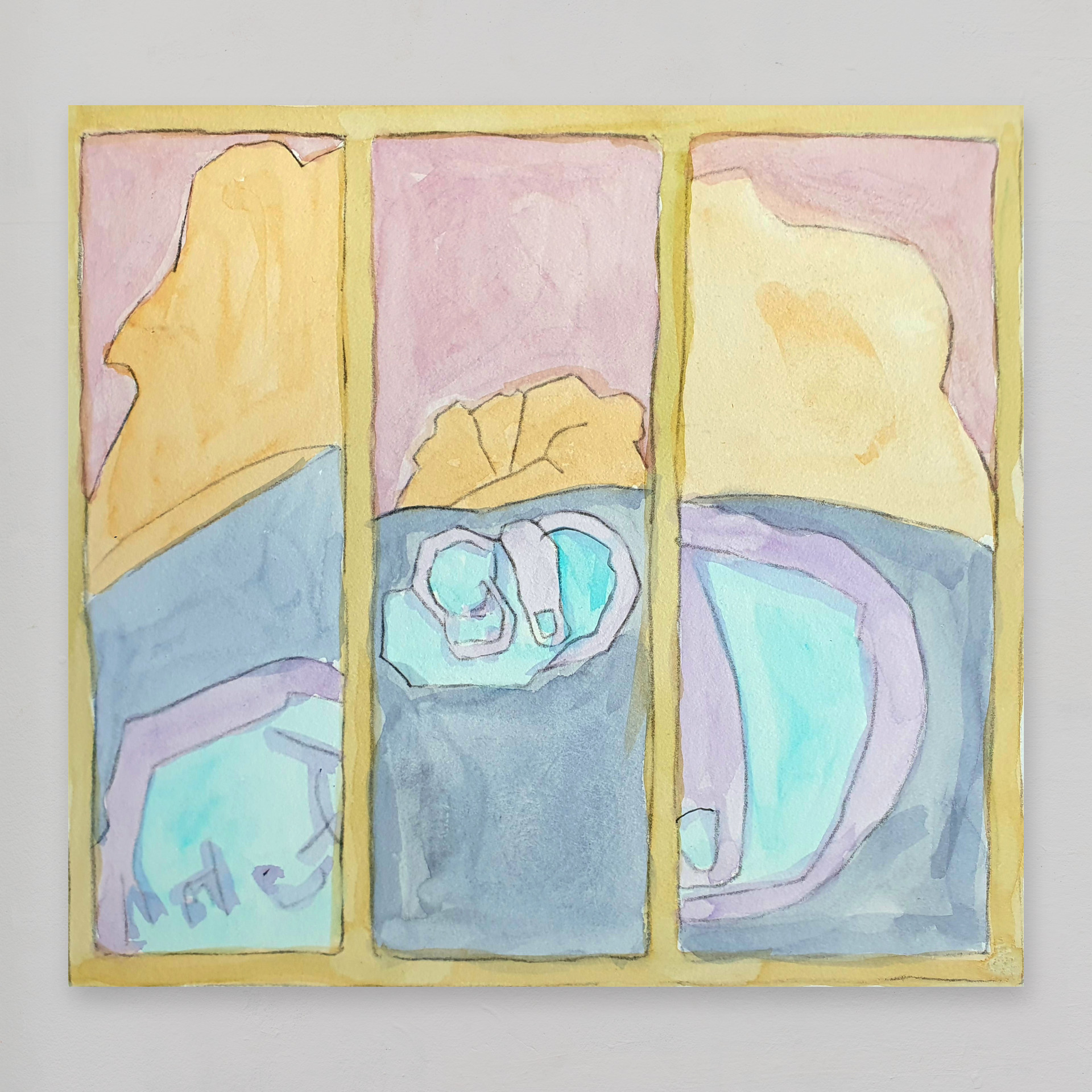
30.07.2023
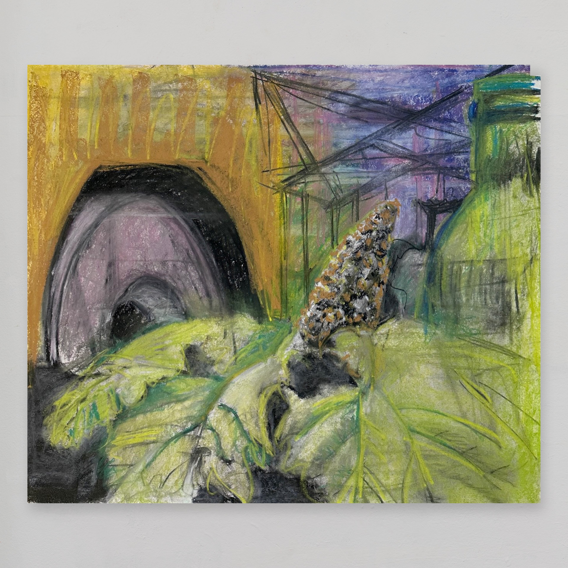
texture and transitions in the composition
using pastel, oil pastel, charcoal and pencil
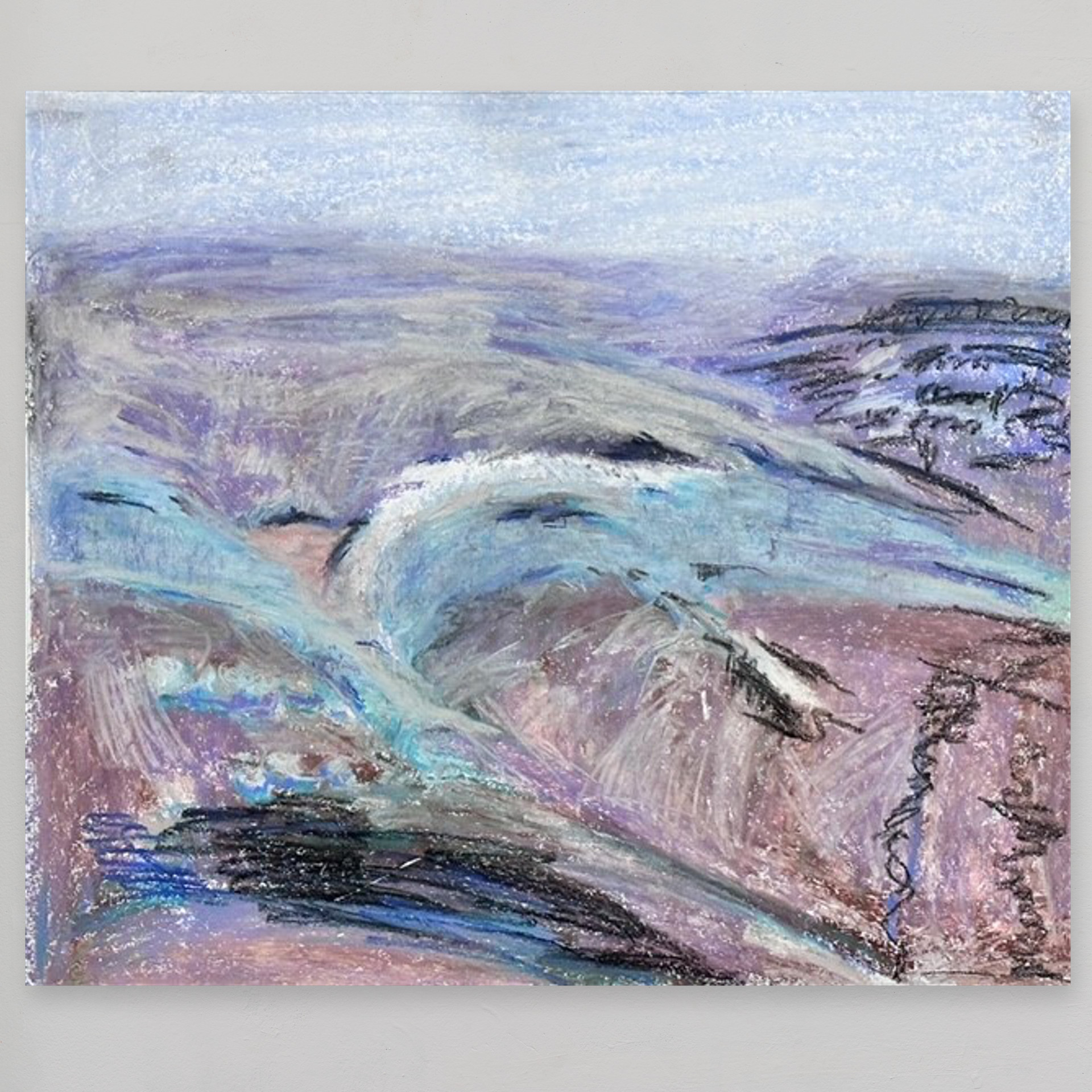
Following my travels in the first half of this year I've got down to some sustained work in the studio again and at last working through ideas I've been thinking about since late 2022!
In a new approach I am now making my studies on A1 paper and no longer in a small (A4) sketchbook as in the past.
The larger-sized paper (each drawing is 52 x 62 cm) encourages me to take more time over the studies, perhaps treating the larger format more seriously than the A4 format, returning to the studies and re-working them where necessary but (hopefully) with the same lack of inhibition that has always characterised my sketchbook studies.
These studies record my interest since late 2022 regarding transitions and texture in the composition of an image.
The medium is mainly soft pastel with additional use of charcoal, compressed charcoal and occasionally oil pastel. This allows me to work quickly which is something I like as I rush to get my ideas out of my head and into the world. With pastel I feel able too to make big changes to the composition as I go along.
In this way I feel I develop different ideas and compositions much more quickly than if I were to use oil colours on a stretched canvas.
If the current series of studies works out - and I think there are positive signs already - then I would like to explore the same ideas and compositions using oil colour on canvas.
It may be that my ideas find their most effective expression (for me, for others too perhaps) in pastel on paper rather than in oil colour on canvas. That remains to be seen.
Pastel is after all a perfectly respectable medium in its own right and one with which over the years I have had great pleasure and no little success. All the same oil painting has fascinated me since I was given my first set of oil colours at the age of twelve.
Illustrations shown (from top to bottom):
- pastel, oil pastel, charcoal on paper "quiet anticipation of the excitement to come"
- pastel, charcoal on paper "we were stuck in a beautiful place"
- pastel on paper "la ruta del pollo"
- pastel, charcoal on paper "did someone bring the popcorn?"
- pastel, oil pastel on paper "chacabuco mist"
- oil colour on raw canvas "rate of change, early version"
- watercolour on paper "waterworks"
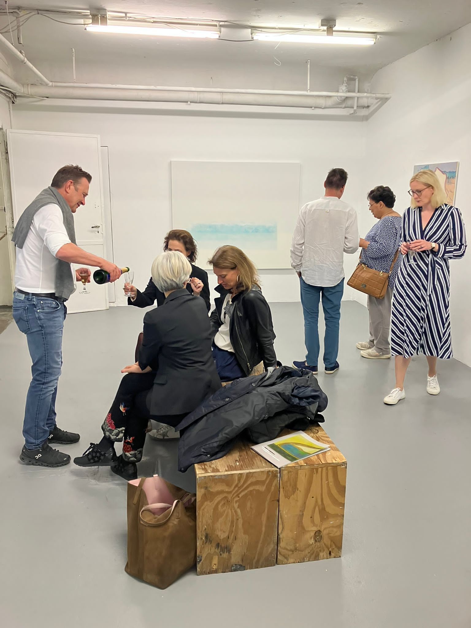
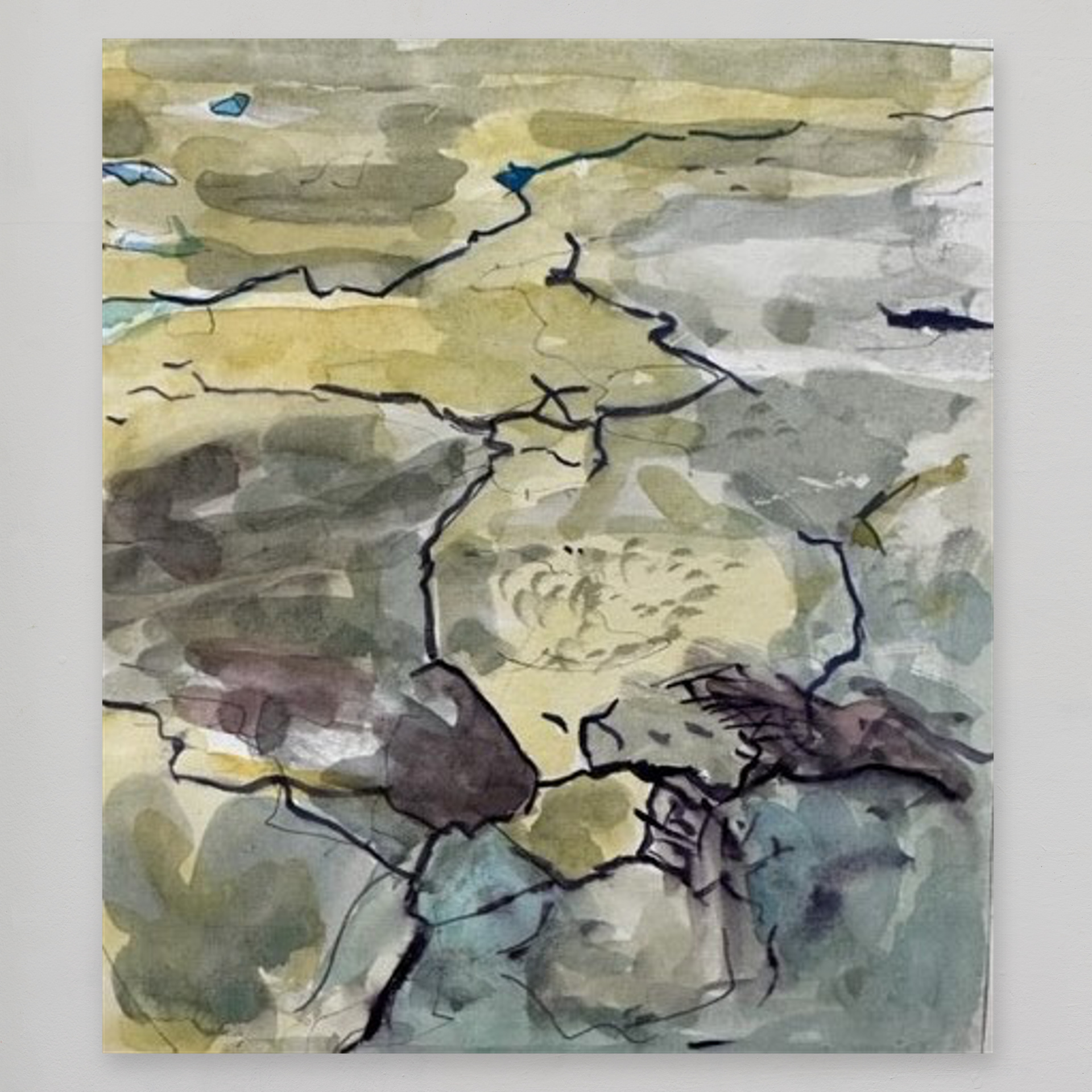
4.05.2023
my latest show at the projektraum, Frankfurt opened last Thursday, 4th May 2023; a special thanks to jacqueline jakobi millán for curating the exhibition; you can download her article in german and in english
you can see installation views of this exhibition on this website by browsing all exhibitions or by clicking here.
thanks to all of you for your kind support and interest
21.04.2023
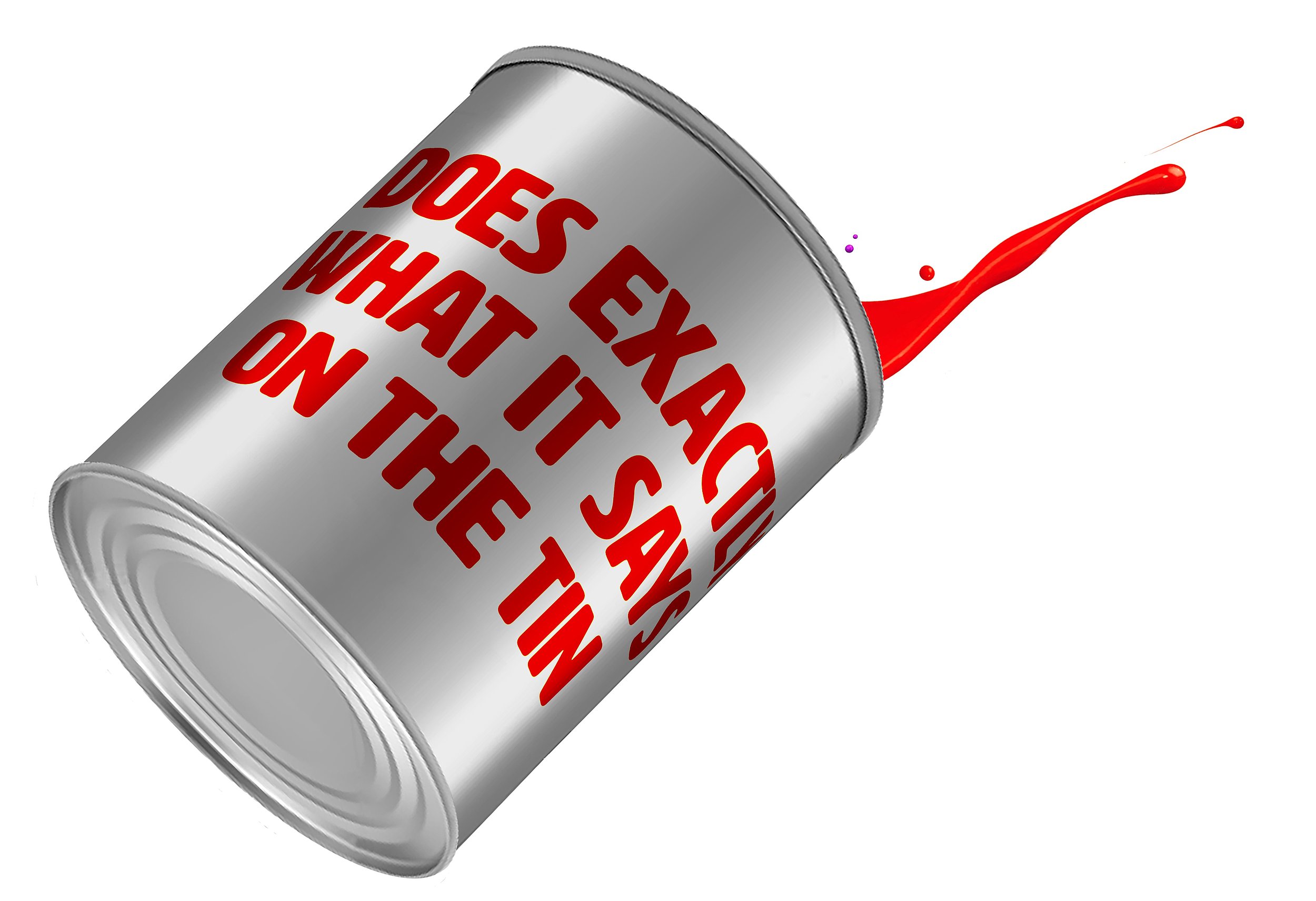
"does it do what it says on the tin?"
vernissage 7 pm thursday, 4th May 2023 (artist present)
projektraum elbestrasse 10, 60329 frankfurt
New work in various media including gouache (watercolour), pastel, charcoal/compressed charcoal on paper, as well as oil on canvas.
Exhibition runs until lunchtime Monday, 8th May 2023. Viewing outside of the vernissage is by appointment only. Please contact either by email (mail@peterneighbour.com) or direct message via instagram (iampeterneighbour).
I look forward to seeing you!
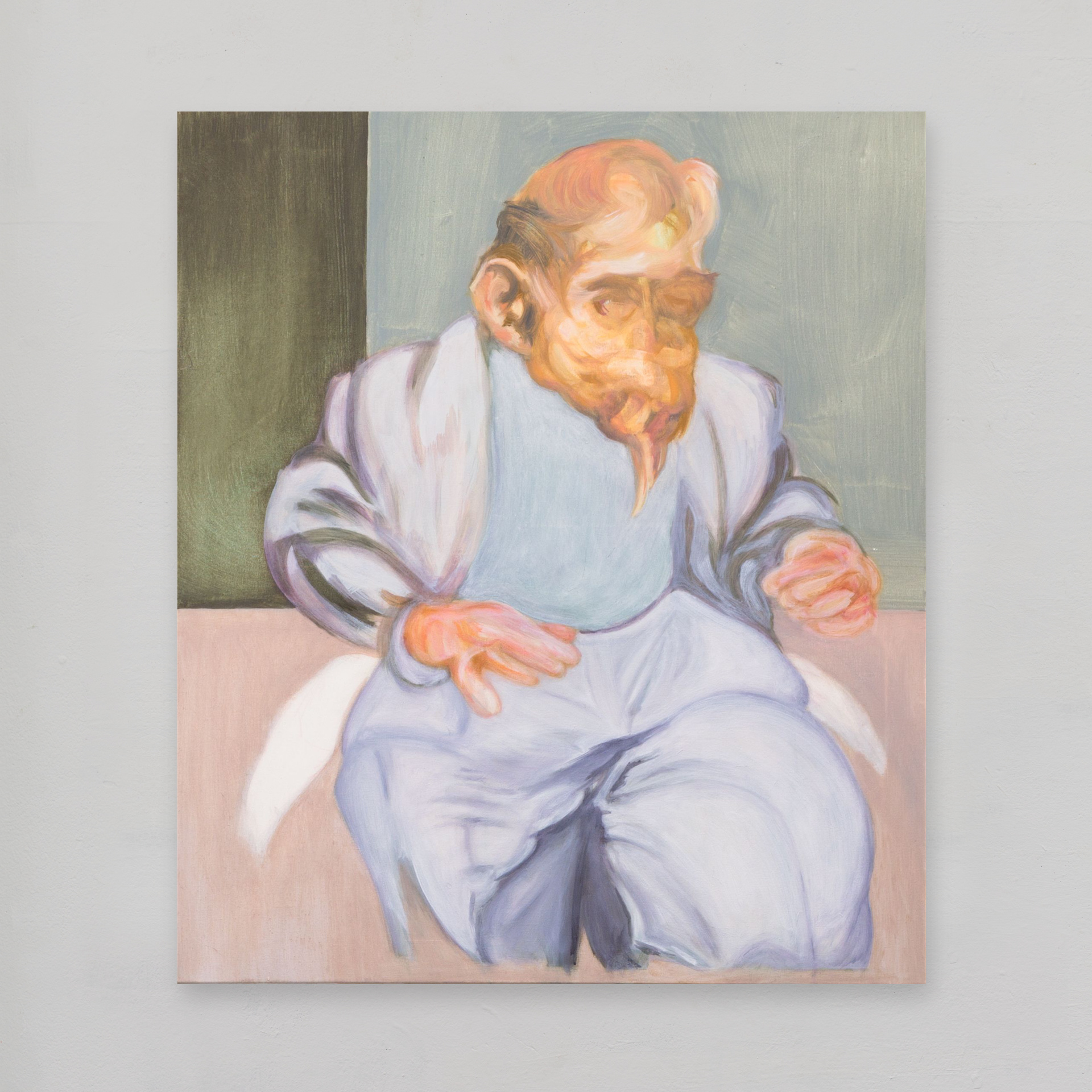
17.10.2022
all trousers and no mouth
a work inspired by memories of working in investment bank dealing rooms.
Image shown:
figure, walking in a room 2015
oil on canvas, 70 x 60 cm


05.10.2022
outcast | how a cartoon character was born
Today's work, jetsam #1 (2022, gouache on paper), is from the series motion pictures.
For each work in this series I have taken a motif or abstract shape that appeared in work from 2021 and for the new work located it as a "character" in a comic strip.
The comic strip format allows the 2-D motif to appear as a dynamic character in its own 3-D world or space without the use of modelling or linear perspective.
The jetsam #1 motif has its origins in the last days of 2020.
Back then I was using the sketchbook to develop my ideas about abstraction with my memories of Antarctica as one source for inspiration. But as my sketchbook began to fill up with cartoons and abstract shapes my personal life provided inspiration too.
Christmas 2020 was a matter of days away from a dramatic overnight change caused by Brexit to my personal situation. Many British citizens - myself included - feared a so-called "cliff-edge" in terms of the changes this would bring to our lives on 1st January 2021. As a British citizen living in the EU my future seemed both unclear and insecure.
The pages of my December 2020 sketchbook show how these two pre-occupations, the Antarctic landscape and Brexit angst collide and combine.
Carried over from earlier 2020 work in oil on canvas the rectangle motif features from the beginning of the sketchbook. But by late December the rectangle is qualified and modified: a creature is perched on top of it, first looking up and later looking down. Then, decisively, the rectangle changes its position in the picture plane. No longer central and on a horizontal line the rectangle is shifted from the horizon to the lower left of the image.
Not only shifted but also turned ninety degrees the rectangle is now vertical and in the bottom left corner of the image. The bird-like creature has returned to perch on what is now unmistakeably an edge - a cliff-edge.
In the following sketchbook pages this avian creature morphs into a blind-folded homunculus, squatting on the rectangle's edge with legs a-dangling. A few drawings later and the little man has been reduced to a mere head, now masked as well as blindfolded with a few wisps of hair and a three-day beard. A few more pages of the sketchbook later and only the mask and blindfold are left - in profile.
This mask/blindfold became at once a comic-strip or cartoon character. During 2021 I started to link my cartoon character explicitingly with the giant rocks (tephra) of Antarctica's Brown Bluff beach the latter jettisoned by the volcano when it erupted one million years before.
In this particular image ( jetsam #1 ) the cartoon outcast seems to be not cast out like the rocks of Brown Bluff but cast ashore, jetsam discarded by the ocean.
Work shown here (from top to bottom):
jetsam #1 2022 20 x 18 cm gouache on paper
stranded #1 2021 30 x 27 cm oil on canvas
eight drawings from A4 sketchbook December 2020
22.09.2022
throwback to 2010 - 2013
the desert scene series
This cycle was inspired by memories. Many years ago I used to travel by train to work: about two-hours each way from rural England into London’s banking district.
Every day as my train sped by I’d stare out of the window at the railway tracks and their micro-landscapes. What began to fascinate me were the neglected and desolate spaces between the railway tracks. Morning and night I saw how these micro-landscapes changed with the passing seasons: now sun-drenched, bursting with life and thick with colourful flowers, now buried in January darkness and the litter of passing passengers.
In my imagination these little strips of wasteland were also a moral wasteland or desert; the annual rise and fall of rugged vegetation an emblem of life’s desperate need for hope. Corners of the world at once familiar and forever out of reach these places and their annual cycle of growth and decay became a source of comfort like the company of an old friend.
Working on the first of these paintings in 2010 I began to feel that the composition lacked a focal point.
My fascination with the goat as a powerful motif and emblem goes back a long way. While at art college in England I often took a goat or a group of goats as a subject for my work.
And so I decided that a goat was exactly what was needed for this series of work.
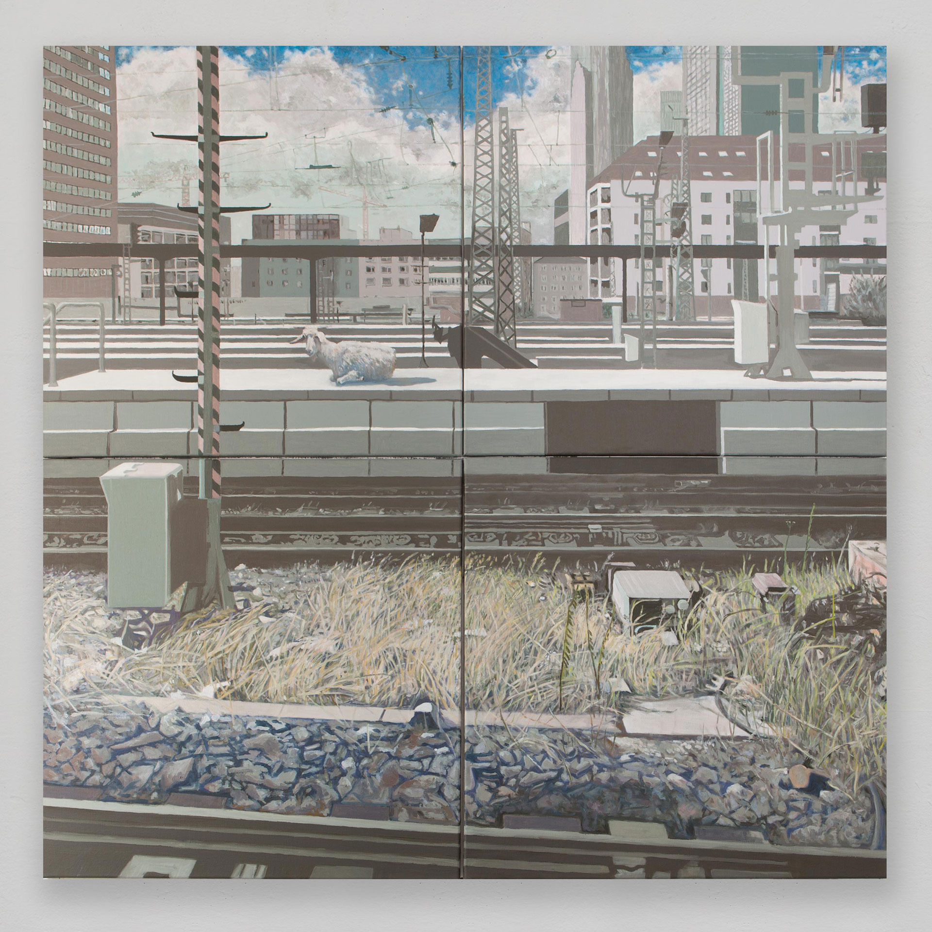
Shown here is the last work in the series desert scene #5 from 2013 with the goat on this occasion located in Frankfurt's main railway station. Four separate images on four separate canvases (each 80 x 80 cm) when hung together form a fifth image.
This work was painted in grey tones using a highly limited palette of only three colours: English red, chrome green and the zinc white.
Look closely, however, in the lower right of the total image and you will see that one small area of the work is painted with additional colours: the weed-covered ground between the railway tracks.
Use the search function on this website (work cycle "scapegoat") to find all the works in this series.

21.09.2022
time postponed: new dates for exhibition
next month's show has been postponed to next year
vernissage now on thursday, 4th may 2023
projektraum elbestrasse 10 60316 frankfurt
11.05.2022
a cinematic approach to abstraction
In recent months I have looked to evolve my position on abstraction further by using formal elements borrowed from the world of cinema and comic strips.
For my current work I continue to use the "almost square" format of 100 x 90 or a version thereof. Each work consists of three rectangles, arranged in the picture plane either horizontally or vertically, as in a comic strip.
For last year's terra fluida exhibition I presented new abstract work derived from my experience in January 2020 of the Antarctic landscape.
The terra fluida exhibition itself showed how my abstract artwork had evolved from the colour field abstraction of 2019/2020 to a new position with abstract shapes and forms by mid-2021.
In both oil colour on canvas as well as in gouache on paper these "terra fluida" artworks featured non-figurative shapes and forms I had created by a process of abstraction using the raw materials of my personal record of the Antarctic landscape.
motion pictures
My current concept re-configures the picture plane in order to re-locate the 2-D terra fluida shapes in an imaginary space of their own.
My methodology has been to subject the "terra fluida" abstractions to a formal process borrowed from cinematography and comic strips.
Cinema uses three basic camera shots to set the scene and tell the story: the close-up, the medium shot and the long shot. Comic books and cartoons also use this device.
I create three views or "shots" of a given terra fluida shape and place each shot or "angle" in one of three horizontal rectangles. The original "terra fluida" shape is now shown as if seen from three separate "view points" or angles, echoing the formal conventions of a comic strip or those of a story board in cinema.
By using this cinematic or comic strip device the artwork is now divided into three distinct but related images thereby gaining a sense of narrative; the abstract shape acquires a sense of personality, as if a character in a comic strip, cartoon or video. The original 2-D shape in the "terra fluida" artwork appears now to be a 3-D object inhabiting its own formal space.
23.04.2022
throwback to 2017 | why I called the painting "fascinatin' rhythm"
this painting is from a period in Frankfurt (2013 - 2017) during which I experimented with different ways of representing the human figure; ways that were not based in realism like the portraits I had painted from life a few years earlier. Part of the work cycle "REGATTA | a race apart" this work was inspired by four elite oarsmen at the top of their game. Stepping back to look at the painting in my Frankfurt studio what went through my mind was the composition's sense of rhythm. Almost at once the song "fascinatin' rhythm" popped into my head. The song is of course a classic and a version sung by Ella Fitzgerald - my Dad was a fan - had long ago lodged itself into my brain. I'm not into jazz myself but the way that the song crashed its way into my consciousness was pure instinct. It felt right that the painting should have the same title as the song.
fascinatin' rhythm is one of several paintings exhibited in my 2018 show "kunst in der konferenzetage" in the offices of Hogan Lovells International, Frankfurt. A pdf file of the exhibition catalogue can be downloaded from this website.
image shown: fascinatin' rhythm, 2017 oil colour on canvas 120 x 100 cm
21.04.2022
throwback to 2016/2017 | inspiration for a work cycle
REGATTA – a race apart | 2016 – 2017
From late 2013 to late 2017 I was focussed on exploring different ways of presenting the human figure, typically using past experience as the emotional trigger for my work. As raw material I would use found images such as publicly available photos on the internet.
In 2016 I began to look at photos of rowing and regattas. I grew up in Marlow-upon-Thames, a small town with its own tradition of rowing on the river Thames and an annual rowing competition – a regatta. I had family and friends who were competitive rowers even though I myself wasn’t involved in the sport.
Henley-upon-Thames is about nine miles further up the road and up river from Marlow. Henley is the birthplace of rowing as a global elite sport, its own regatta being styled as Henley Royal Regatta. Baron de Coubertin, founder of the International Olympic Committee took inspiration from its rules and organisation.
The aftermath of the 2016 referendum in Britain caused me to look afresh at the Henley Regatta which I had visited in July 2014. Henley Royal Regatta is a key date in the social diary of the English upper classes. As well as a sporting event Henley Regatta is a vivid display of hierarchy by those who see themselves as members of a superior social caste. There is a hierarchy of different spectator "enclosures", with strict entry requirements and strict dress codes; you are what you wear. Those spectators not watching from such an enclosure can watch from the publicly-accessible river bank. Space is at a premium so that people are crushed along the narrow strip of grass that follows the course of both river and race. Champagne and strawberries ease the pain.
The race tournament officials – the stewards - are themselves former oarsmen. They wear loudly-coloured jackets - blazers - which advertise to insiders their membership of a particular rowing club. Unsurprisingly, some clubs have greater status than others.
The stewards enforce the regatta’s set of rules, the latter known as “the conduct of races”. The double meaning of the word “race” is something I decided to exploit when giving a title to some of the images in this work cycle.
Rowing’s dedication to training is typical of its compulsive, addictive nature. In fact, rowing isn’t a sport at all; it’s an addiction and these elite sportsmen and women are a race apart.
The English upper classes likewise see themselves as an elite and as such revel in Henley Regatta's modern incarnation as a competition for rowing's global elite. Holding on to power, as this caste has done for centuries, requires a different sort of conduct. In fact it is a game without rules and no sport for self-styled ladies and gentlemen. In truth, power is but an addictive end in itself whereby those who are in power self-servingly view themselves as a race apart.
Use the website's search function to explore this and other work cycles or series, past and present.
13.04.2022
the rectangle
and how it went from colour field to comic strip
the terra fluida catalogue records changes in my abstract work from late 2019 to 2021. It documents how at first a rectangular colour field was central to the composition of large canvasses and then how, via sketch book studies and other works on paper, the rectangle evolved into something linear and fluid as new shapes appeared in new paintings, similarly linear and cartoon-like.
As well as being linear and dynamic, the rectangle was by early 2021 no longer fixed at the centre of the composition. However, the composition underwent even more radical change later as the rectangle went from being three rectangles instead of one. Two canvasses, "breaking away" and "you go your way and I'll go mine" illustrate this development and are both in the terra fluida catalogue (pages 22 and 23).
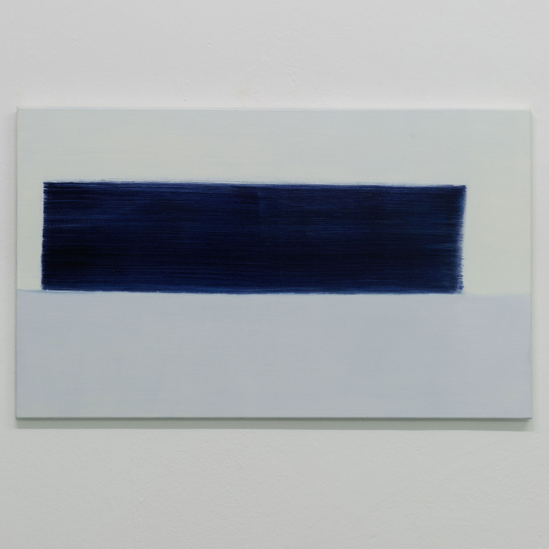
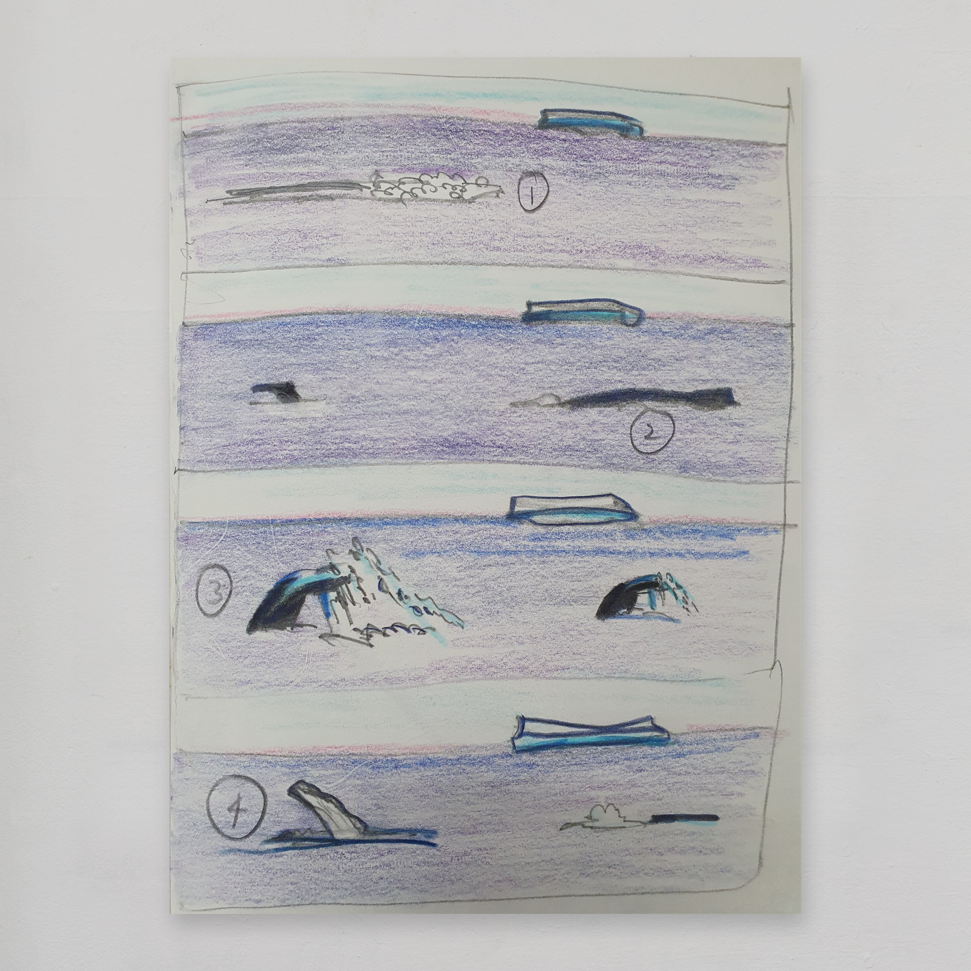
Two images serve to illustrate for the purposes of this blogpost how the compositional device evolved: violet and yellow, a colour field painting in oil colour from 2020 and a 2021 notebook sketch (not in the exhibition) in pencil and gouache.
Using the three horizontal rectangles as formal elements took me back to an idea in a sketch from in December 2020. Composed of four horizontal rectangles, the sketch illustrates different stages of an event, in this case whales feeding in the Antarctic ocean; the passage of time is indicated by the comic-strip format.
I am currently working in the studio to develop these ideas further. I have re-visited the linear shapes created for and exhibited in last year's terra fluida exhibition. I have been looking at how cartoon strips and comic novels go about creating a sense of movement and 3-D space. I have also been looking at how cinema, like comic books, typically uses three shots taken from three different distances and/or angles to add dynamism as well as a sense of depth to the narrative.
And so in the studio I have been trying out these ideas and applying this treatment to some of my terra fluida shapes and images. I aim to give these flat, abstract linear shapes a sense of movement and that they inhabit their own unique 3-D world by using formal elements taken from comics and cinema rather than by using a single image with one traditional perspective.
6.04.2022
studio notes | about the title of a new work
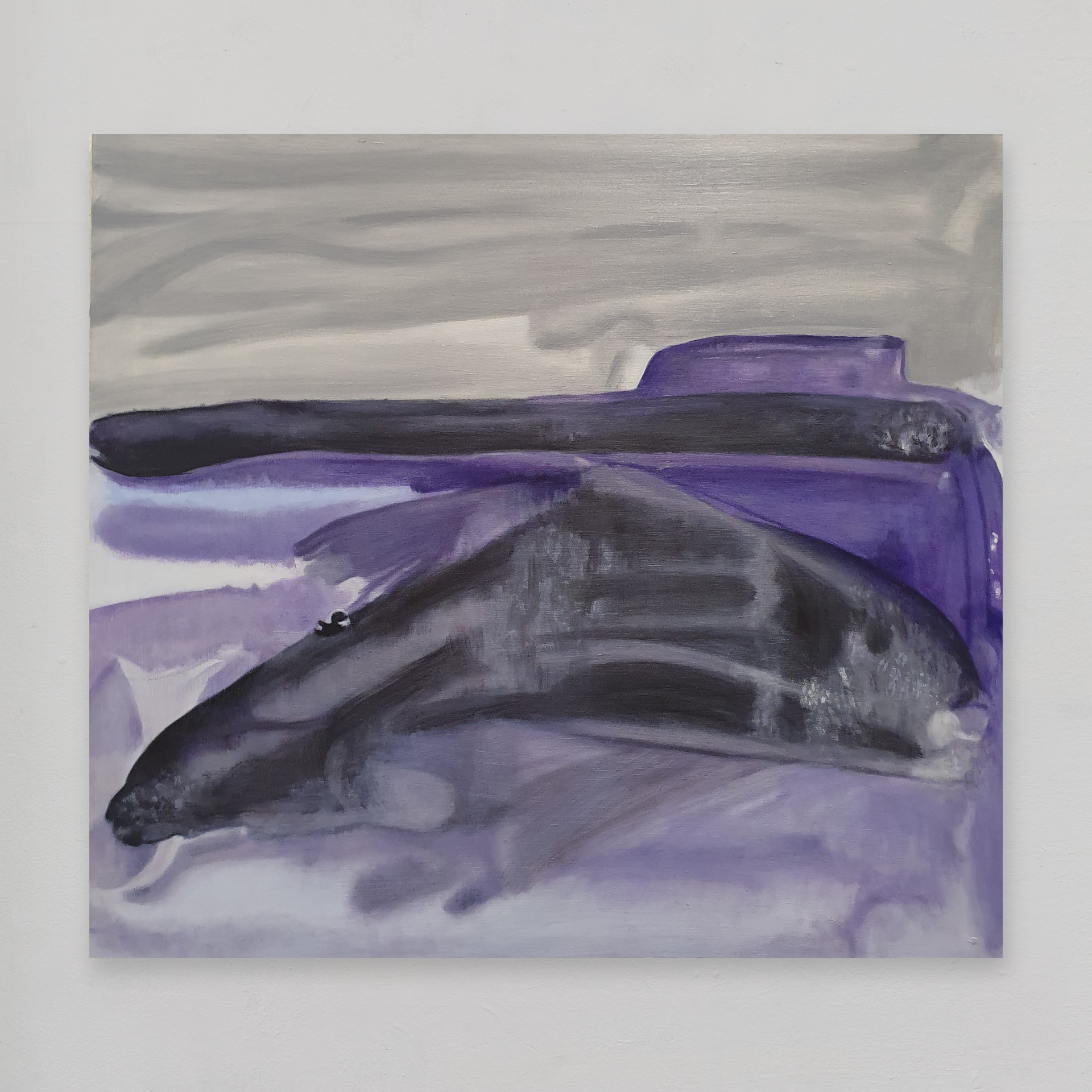
after the visit oil colour on canvas 72 x 80 cm
the title for this painting came about in the following way. As the work neared completion it reminded me of my trip to Antarctica in January 2020. How so? Well, I imagined the rectangle to be a ship on the horizon, leaving the scene after an earlier shore landing. During that landing, so my imagination continued, the local fauna had hidden away in response to the human disturbance. But as the ship disappears over the horizon the wildlife feels it safe to come out and play. ? The black "creature" of the work's composition was a total accident. I had been playing around with some ideas on paper using gouache. I made some free style random brushstrokes in black. These brushstrokes were intended as loose abstractions of shapes and forms remembered from photos of feeding whales. Now I make a point of working very quickly in watercolour and as so often happens there was way too much water on my brush. Pools of water had collected on the paper and so I grabbed a sheet of kitchen paper to absorb the excess water. Acting as blotting paper the kitchen paper left its pattern behind and some interesting effects. My earlier black brushmarks, brought to life by these effects, now had features and a personality. Oil painting is a versatile but challenging medium and I'm always keen to find new ways of working with oil colour. So I decided to see how the composition might work in oil on canvas, but without the use of kitchen paper this time!
To enquire about purchasing artwork please email.

11.02.2022
new neighbourhood, familiar subject
here you see the shiny new ECB (European Central Bank) headquarters tower which is a short walk from my new studio. I came to this part of Frankfurt ten years ago when the frame of the tower was being erected as part of a giant construction project built around the shell of a listed building, Frankfurt's Großmarkthalle.
I have always found building sites fascinating. So when in 2012 I came upon this construction site it didn't take me long to decide to turn the subject into a work project. At this time too the Eurocurrency project was itself gripped by an existential struggle so that the whole headquarters project seemed to me an act of hubris. I became obsessed with the site and spent almost all of 2012 at the site, making drawings that would later be used as studies for large oil paintings, including Twisting in the Wind (2013, oil on canvas).
The Großmarkthalle, I later learned, played a central logistical role in a dark chapter of Frankfurt's history. It was here that the locals rounded up Frankfurters of Jewish faith promising them a "new life" in the East.
To commemorate the rounding up and murder of Frankfurters by their fellow Frankfurters a public footpath now runs along the ECB perimeter marked with moving eyewitness quotations telling of their horrendous and heart-wrenching experiences from that shameful time.

01.02.2022
new studio: re-painting walls white!
my new studio is in an office building formerly occupied by Telekom engineers; the walls are painted a nicotine yellow - very off-putting when painting etc in colour.
So I'm painting the walls bright white. The overhead lights are yellow too so I plan to replace them with natural light tubes.
as you can see I'm not the tidiest of decorators!

07.02.2022
new part of town
my new studio is near the Ostbahnhof in Frankfurt's Ostend. The clue is in the name: I'm now in the East End of central Frankfurt. This area has undergone significant change since the ECB headquarters was located here during the last decade. Old buildings are being pulled down to make way for "smart" apartments. 'Twas ever thus.
31.01.2022
new storage space
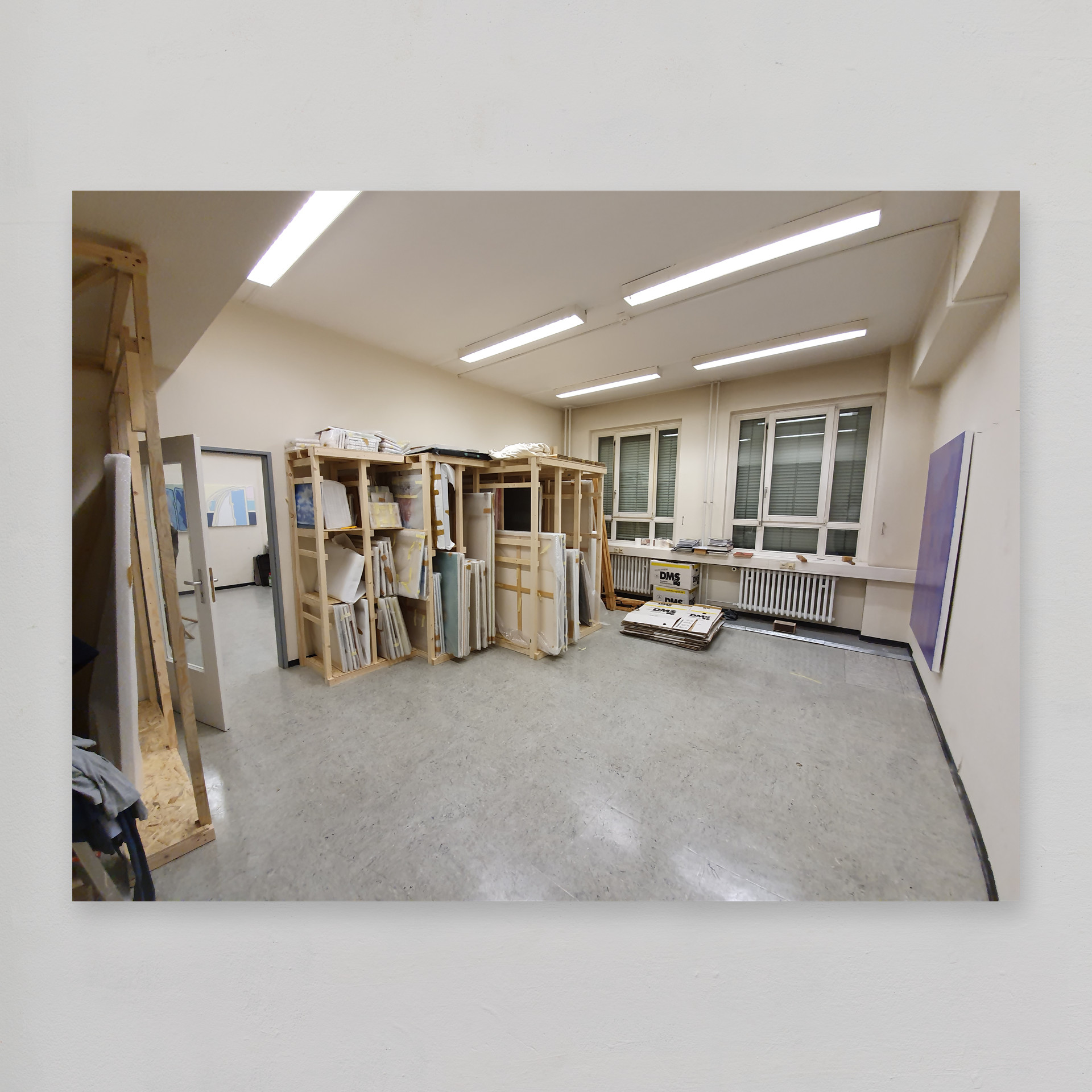
I've had a storage system built in my new studio so that I can store canvasses safely and make best use of the studio space.
30.12.2021
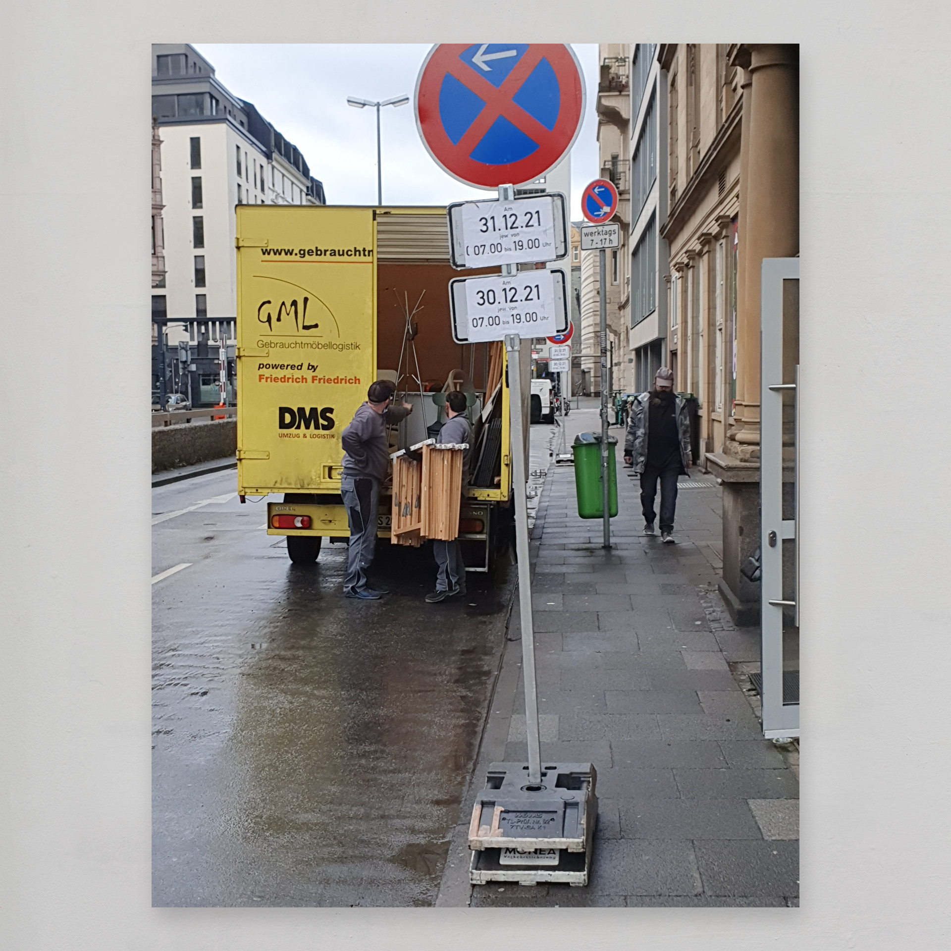
moving into a new studio
here is the van to take ten year's plus worth of work and memories to the new place in Frankfurt's East End.
29.12.2021
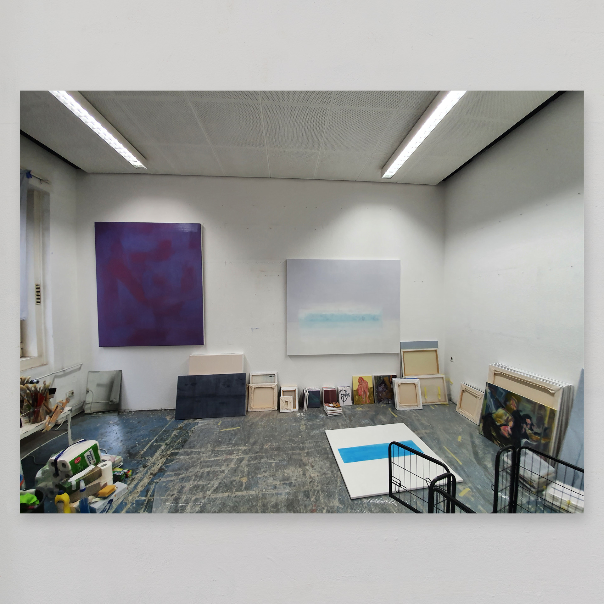
after ten years, it's a poignant good bye
to my old studio in gutleutstraße 8 near the Frankfurt Opera and City theatre. It amazes me how far I have come during these ten years. I have learned much and met many interesting people along the way. It's also been helpful to have the chance to show my work. There's nothing like an exhibition deadline to focus the mind!
20.12.2021
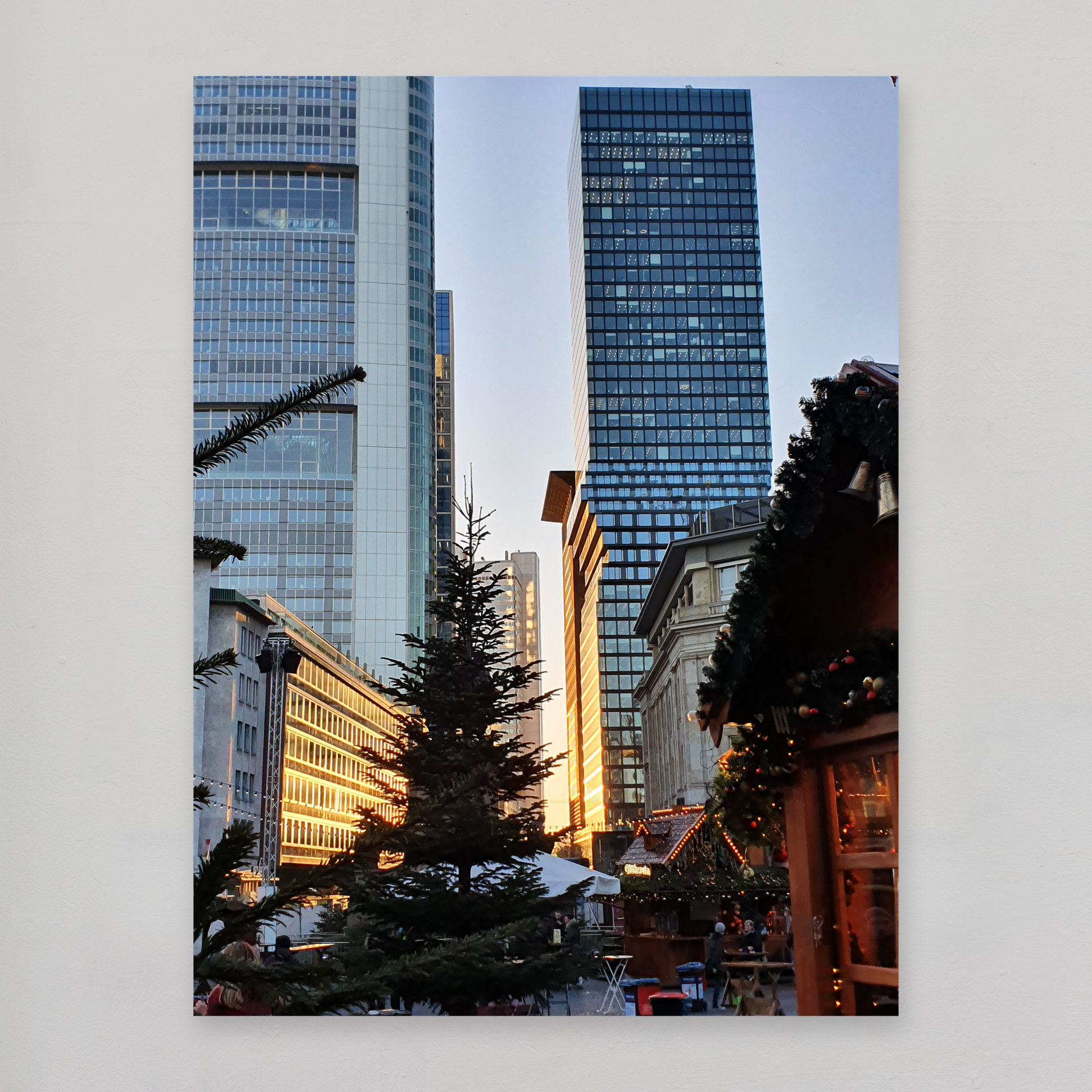
Omniturm at sunset
from the Christmas market the view of the Omniturm at sunset. In 2019 I was commissioned to make some studies of the Omniturm tower.
20.08.2021
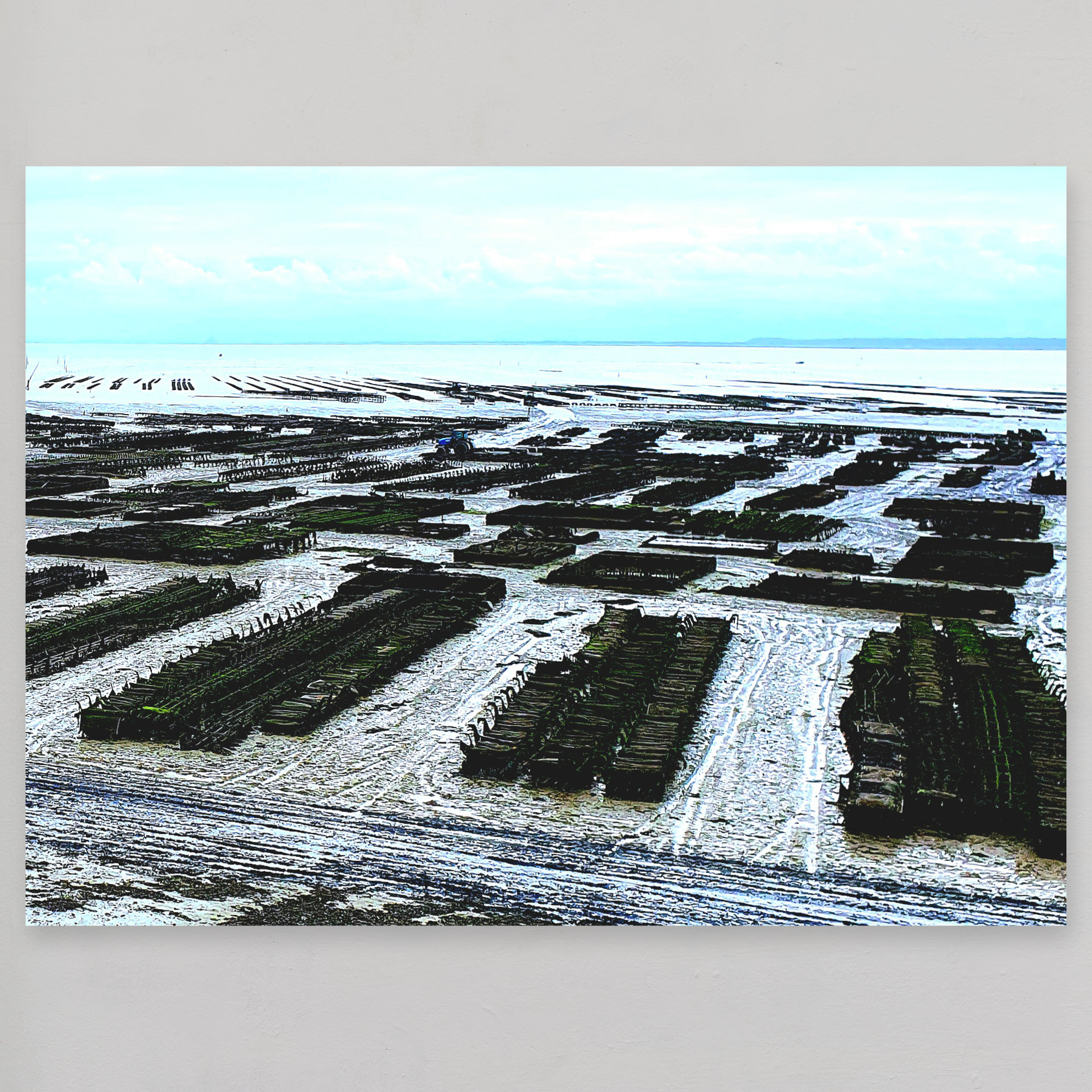
oyster beds at cancale
a month after the exhibition "terra fluida" I'm at Cancale. I was fascinated by its celebrated oyster beds. Perhaps one day I'll make some work based on this subject. The oyster beds make me think of the Normandy landings, or the Battle of Helm's Deep.
22.07.2021
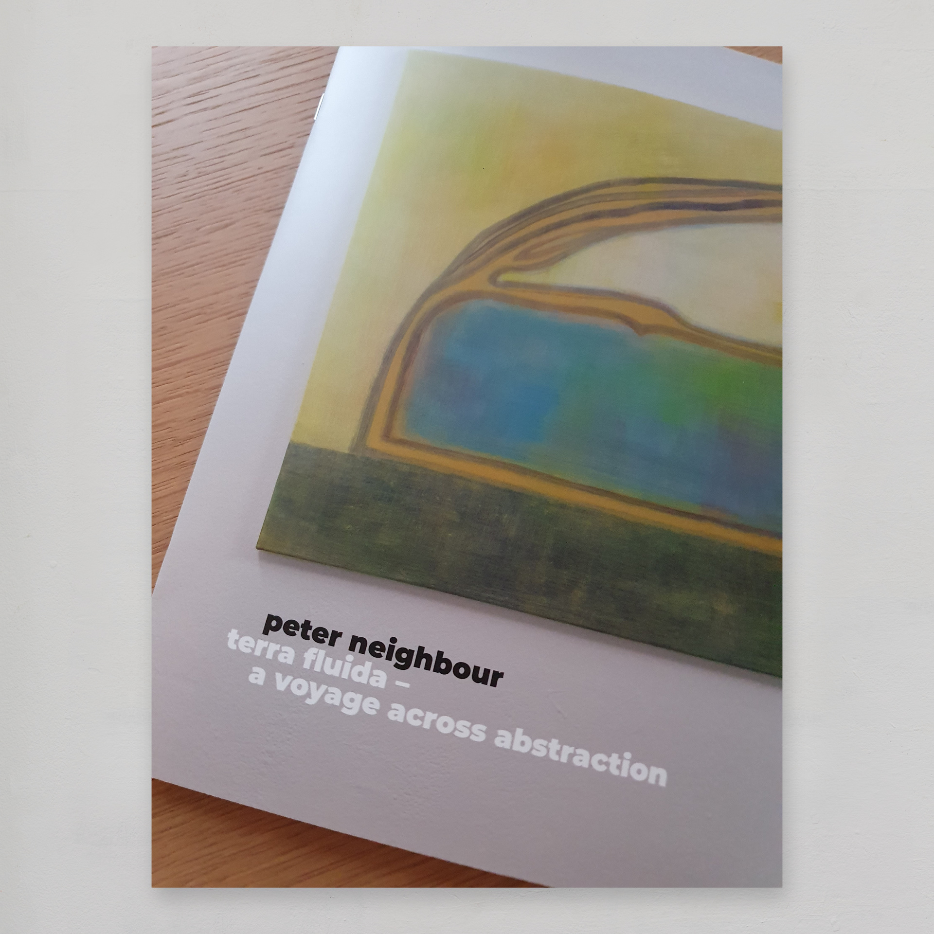
just in! exhibition catalogue for terra fluida
I'm very pleased with how the catalogue turned out. As well as having photos of the July 2021 exhibition the catalogue has some text explaining the ideas and processes behind the work on show.